
Stake your claim effectively.
Our
Expertise
We uncover your unique value in the market and develop clear positioning strategies that separate you from competitors, align with your audience, and drive preference.
Positioning Statement Development
A concise, strategic statement that defines your place in the market.
Competitor Messaging
Audit
Analysis of how your top competitors communicate and where you can stand out.
Audience Perception
Mapping
Insights into how your target audience currently sees you — and what they need to hear.
Value Proposition
Definition
Clear articulation of what you deliver, how it helps, and why it matters.
Points of Differentiation
The 3–5 key traits or advantages that make your brand distinct.
Positioning Framework
A structured model that includes audience, category, benefits, and proof points.
Brand Promise Language
A short, memorable line that reinforces what customers can always expect from you.
Competitive Messaging Map
Visual layout of white space, messaging overlap, and brand voice gaps in your category.
Featured
Work
From killer branding to performance-driven digital strategies, we help businesses stand out, scale up, and dominate. Our work isn’t about chasing trends; it’s about redefining them.

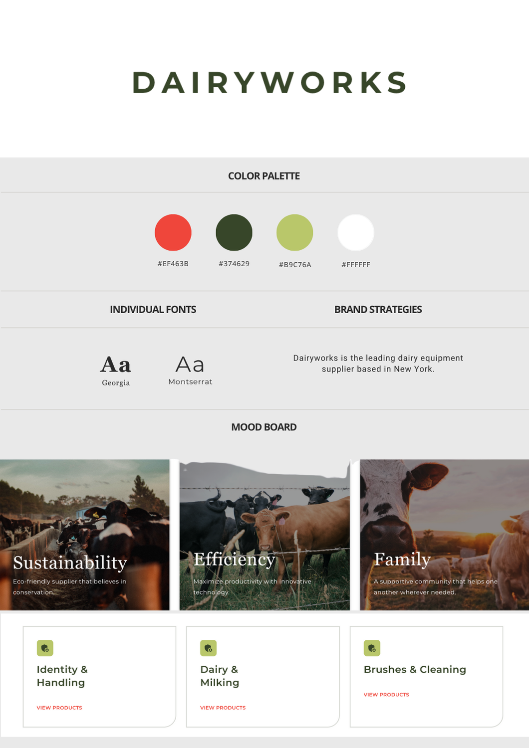
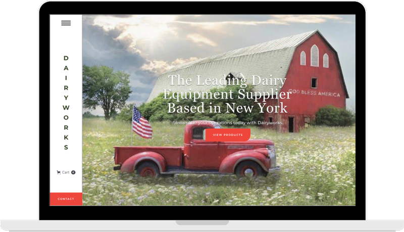
Dairyworks
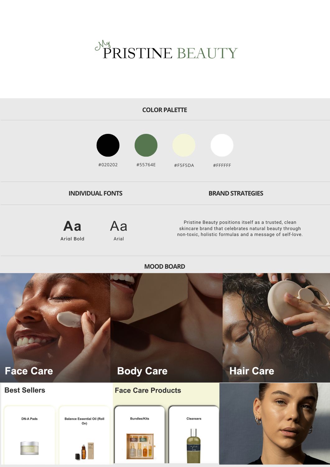
Pristine Beauty
Sales Enablement
Client Overview
The Goals
- Designing a website that authentically represents the brand’s values
- Creating a fast, streamlined user experience for farmers and vendors
- Establishing a credible, modern online presence to support long-term growth
Our Approach
Strategy & Execution
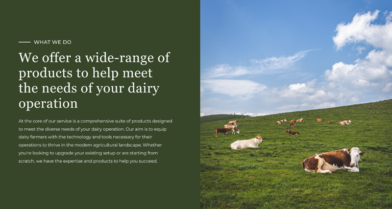
We led with a UX-first design philosophy rooted in clarity, trust, and speed—just like Dairyworks' own service ethos. The structure prioritized quick access to core offerings, contact information, and brand credibility.
To attract a new generation of buyers while staying true to the brand’s legacy, we focused on organic visibility through SEO. By optimizing on-page content, metadata, and search architecture, we ensured Dairyworks ranked for high-intent, industry-specific queries. The result was a steady stream of inbound traffic from farmers and vendors actively seeking refrigeration and equipment services.
We developed a lifecycle email strategy to keep Dairyworks top-of-mind with existing clients—featuring seasonal service reminders, maintenance tips, and product education. Paired with a content strategy focused on retention, we created value-first materials that reinforced Dairyworks’ expertise and reliability—building long-term trust and customer loyalty with every send.
Key Platform
- Development: Webflow
- Performance: Optimized for fast load times and mobile usability
- Marketing Channels: LinkedIn, Google, Email
Visual & Creative Highlights
- Minimalist Layout with Heritage Cues
We used a grid-based structure, soft neutral tones, and subtle typographic nods to tradition—bridging old-school reliability with modern usability - On-Brand Photography and Iconography
We incorporated real service imagery and custom farm-inspired icons to build authenticity and break away from cold, corporate templates - Streamlined Navigation for Utility
A sticky header, clear CTAs, and no-nonsense menu structure make it easy for busy farm operators to find what they need—fast
Results
Qualitative Wins
- A faster, mobile-optimized experience that mirrors Dairyworks’ service efficiency
- A brand-aligned, professional site that builds trust with existing and new customers
- A modern digital foundation built for scalability as the business continues to grow

Client Overview
The Goals
- Designing a modern, elegant website that reflects the brand’s values
- Driving qualified traffic through SEO and targeted social media campaigns
- Generating consistent online sales through an optimized e-commerce experience
Our Approach
Strategy & Execution
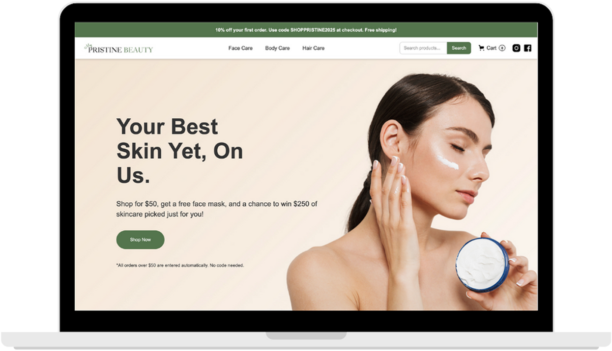
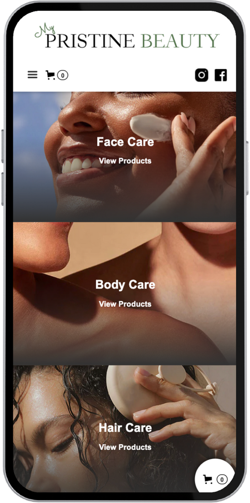
We delivered a sleek, editorial-inspired UX/UI approach tailored to showcase a curated product catalog. Built on Webflow, the site emphasizes clarity, elegance, and seamless conversion pathways—from homepage discovery to product checkout.
On the marketing side, we implemented an organic-first growth strategy, focusing on long-tail SEO optimizations and search-optimized content architecture. Simultaneously, we launched targeted campaigns on Meta platforms to drive traffic and build retargeting audiences.
We crafted high-impact product landing pages designed to convert at every scroll—combining persuasive visuals, crisp messaging, and social proof. Automated sales flows handled abandoned carts, welcome series, and limited-time offers, ensuring shoppers were engaged from first click to final checkout.
Tools & Stack
- Development: Webflow
- Marketing Channels: SEO (Google Search), Meta Ads (Facebook/Instagram)
- Analytics: Google Analytics, Meta Events Manager
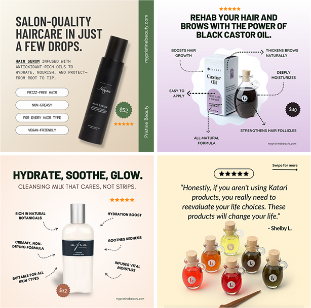
Visual & Creative Highlights
- Immersive Product Showcases:
A clean, conversion-ready interface featuring high-resolution product visuals, interactive filtering, and scroll-based animations - Engaging Social Creatives:
A series of eye-catching ad creatives tailored for Meta platforms, spotlighting seasonal offers, user testimonials, and beauty bundles
Results
Qualitative Impact
- 25,000+ website events tracked
- 3,500+ unique users engaged
- First sales came through within 90 days of launching ad campaigns
Qualitative Wins
- A significant uplift in brand trust and customer confidence
- Scalable content architecture for ongoing SEO growth
- Positive client feedback and an elevated brand presence across platforms
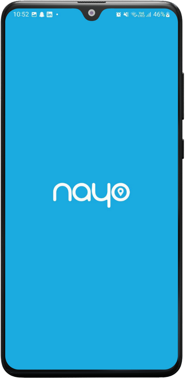
Nayo
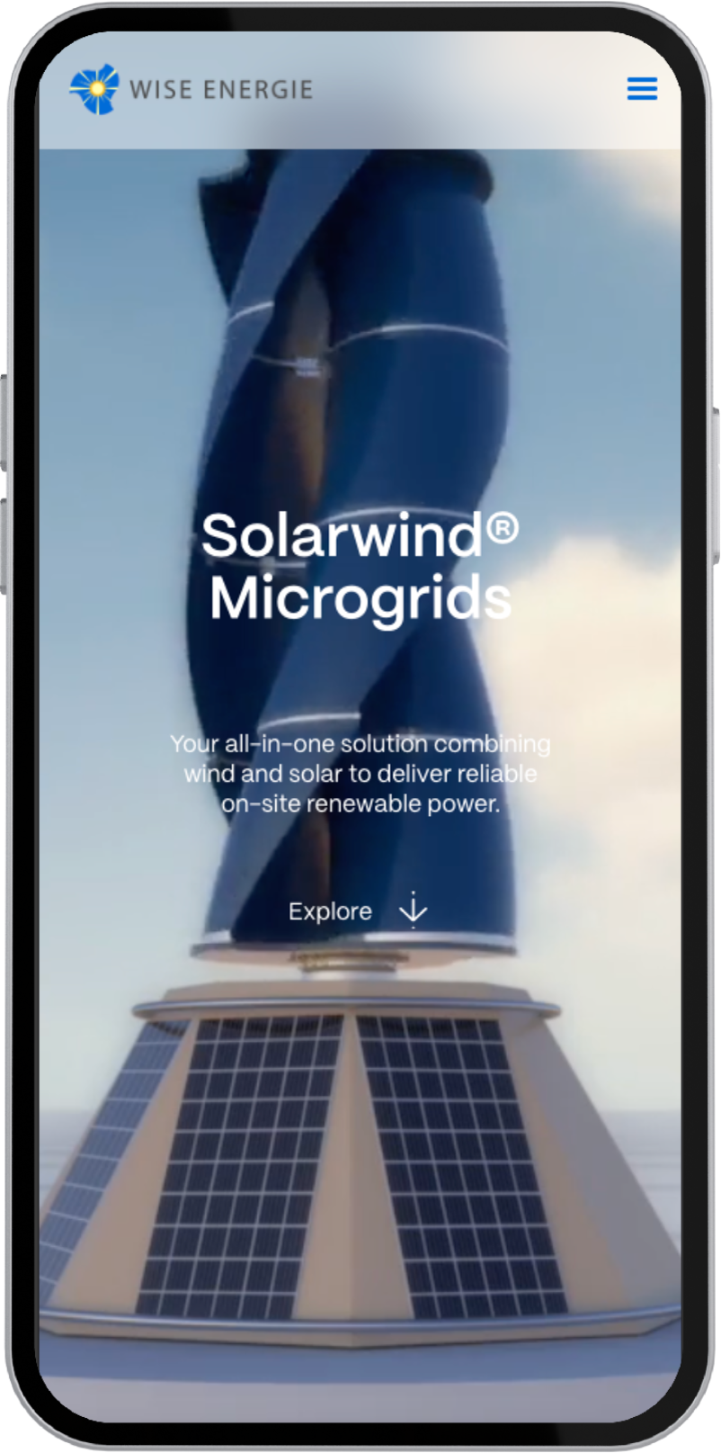
Wise Energie
Client Overview
The Goals
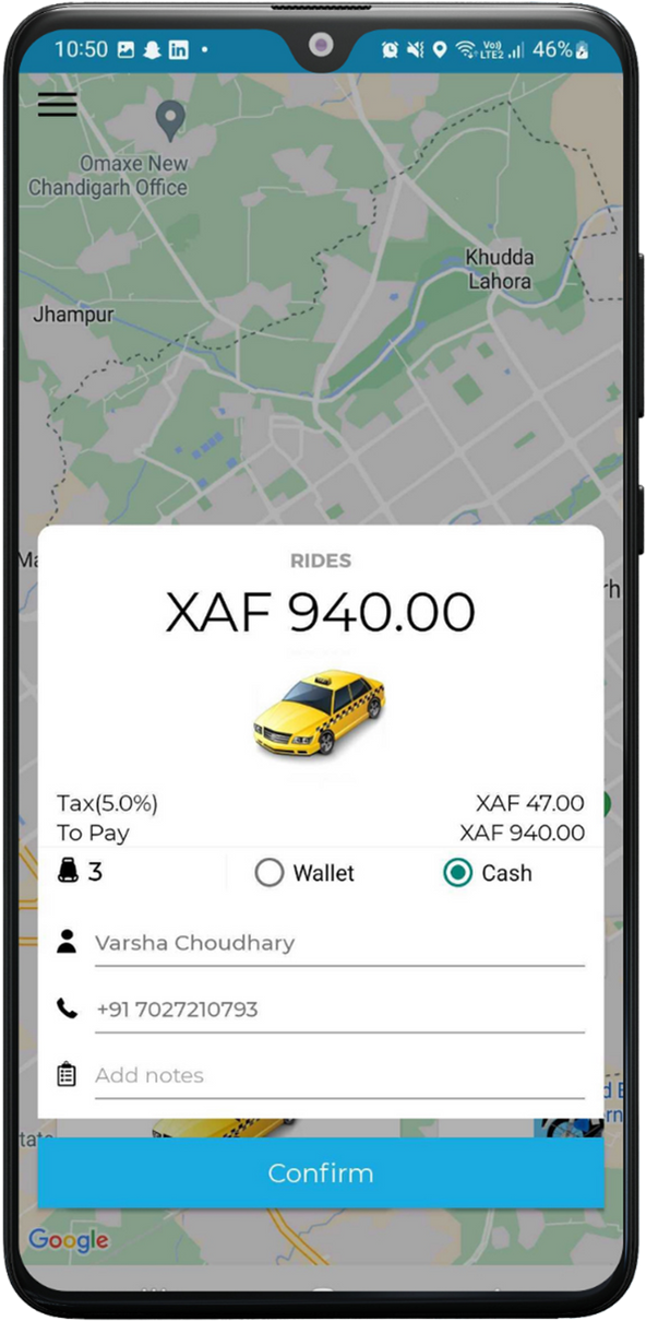
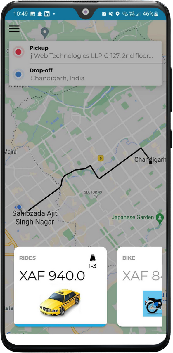
- Develop a bold, intuitive app interface aligned with brand values of safety, simplicity, and speed
- Craft a seamless UX for riders and freelance drivers across different ride types (taxis, bikes, private cars)
- Deliver a high-performance app that’s optimized for rapid adoption and ease of use

Our Approach
Strategy & Execution
We built a bold, intuitive brand identity that reflects Nayo’s mission to make urban transport safer, simpler, and more accessible. From the logo design to a streamlined UI/UX system, every element was crafted to serve a wide user base—from tech-savvy riders to first-time app users. Developed using React, the app emphasizes performance, scalability, and ease of use—with a responsive map interface, frictionless booking flow, and built-in trust signals like driver ratings and verification.
Tools & Stack
- Development: React
- Design System: Lightweight UI kit built for speed and legibility
- Focus Areas: Rider onboarding, booking flow, geolocation integration, trip tracking
Visual & Creative Highlights
- Localized Design with Global Feel:
We blended bold Cameroonian color accents with intuitive navigation patterns common to global ride apps—ensuring instant familiarity and cultural relevance - Microinteractions That Guide & Delight:
From button states to live trip feedback, every tap and swipe is met with responsive feedback for user confidence - Streamlined Booking Flows:
Riders can choose between taxi, car, or bike in seconds—no clutter, just clarity
Results
Qualitative Impact
- 1,000+ downloads within weeks of launch, with rapid early adoption from local riders
- High app performance across regions, even on lower-end mobile devices
Qualitative Wins
- A smooth, fast-loading app praised for ease of use and design clarity
- Strong alignment between brand values and user experience
- Positioned Nayo as a credible, tech-forward alternative in Cameroon’s transportation space
Client Overview
The Goals
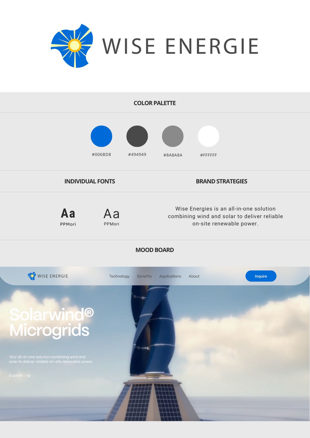
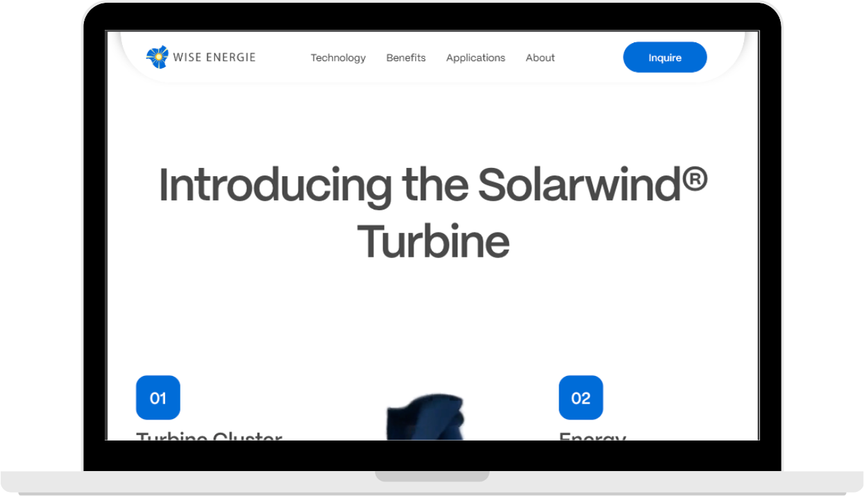
- Crafting a bold, future-focused brand identity that inspires trust
- Designing a clean, compelling website that communicates the technology simply
- Showcasing the versatility of the product for multiple high-impact sectors
Our Approach
Strategy & Execution
We led with a clarity-first design system, built to convey advanced technology in a way that’s both aspirational and accessible. The brand identity leaned into bold typography, sustainable color palettes, and modular components—creating consistency across the web experience.Built on Webflow, the site is fully responsive, lightning fast, and easy for the Wise team to update as new applications and use cases emerge.
Tools & Stack
- Development: Webflow
- Design Approach: Modular layouts, intuitive hierarchy, clean grid structure
- Performance: Speed, mobile responsiveness, and low-friction navigation
Visual & Creative Highlights
- Impact-Driven Homepage Design:
The homepage quickly communicates Wise Energie’s unique hybrid approach with dynamic visuals and sector-specific callouts - Energy-Inspired Motion Design:
Subtle scroll animations and microinteractions evoke the movement of wind and solar—giving life to a traditionally static sector - Scalable Sector Architecture:
The website was designed to scale vertically, with easily replicable modules for new industries, partnerships, or case studies
Results
Qualitative Wins
- A fast, high-performance website that mirrors the reliability of Wise’s product
- Strong visual storytelling that reinforces the company’s innovation and trustworthiness
- A scalable digital framework ready to grow with the business across sectors
Ideal
For
Brands entering a competitive market, undergoing a shift in direction, or struggling to clearly articulate what makes them different.
Startups
Needing investor-ready positioning.
Brands
Entering a crowded category.
Companies
Undergoing repositioning or expansion.
Organizations
Re-aligning around new leadership or vision.
Our
Process
We combine qualitative insights, market analysis, and customer perspective to position your brand with intention and clarity.
Research
Extract
Adapt
Define
Ready to Define What Sets You Apart?
Let’s shape a position your audience remembers — and your competitors can’t ignore.
Copyright 2026. Brandsbyday LLC