
Work That Moves Brands Forward
Explore the projects, campaigns, and creative systems we’ve built to help brands grow, stand out, and perform.
Great work doesn’t just look good — it drives results.
Our
Work
From killer branding to performance-driven digital strategies, we help businesses stand out, scale up, and dominate. Our work isn’t about chasing trends; it’s about redefining them.

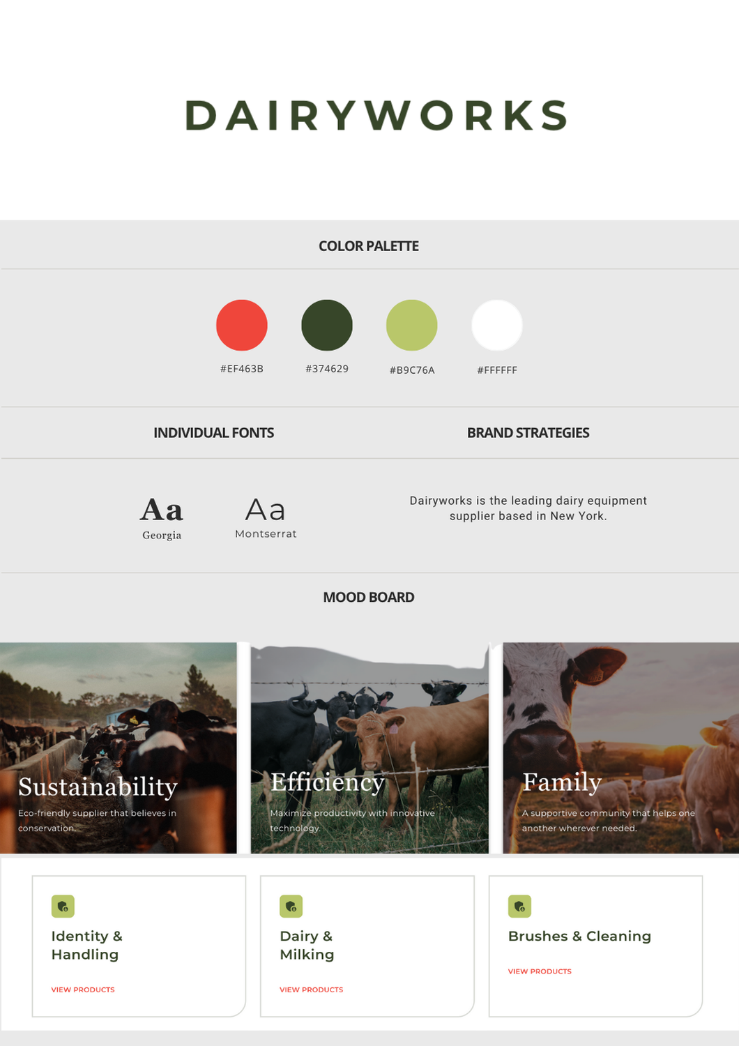
Dairyworks
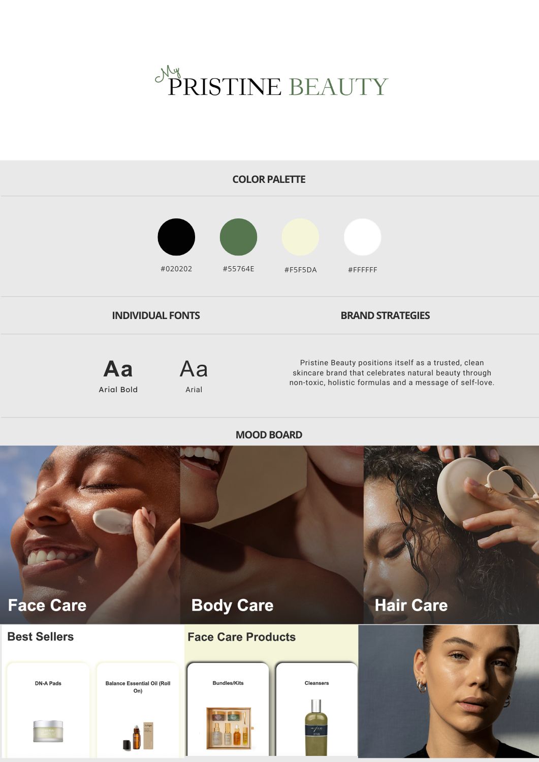
Pristine Beauty
Sales Enablement
Client Overview
The Goals
- Designing a website that authentically represents the brand’s values
- Creating a fast, streamlined user experience for farmers and vendors
- Establishing a credible, modern online presence to support long-term growth
Our Approach
Strategy & Execution
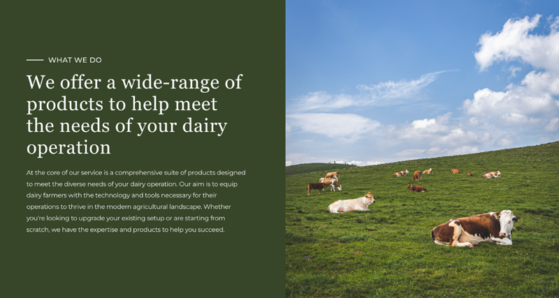
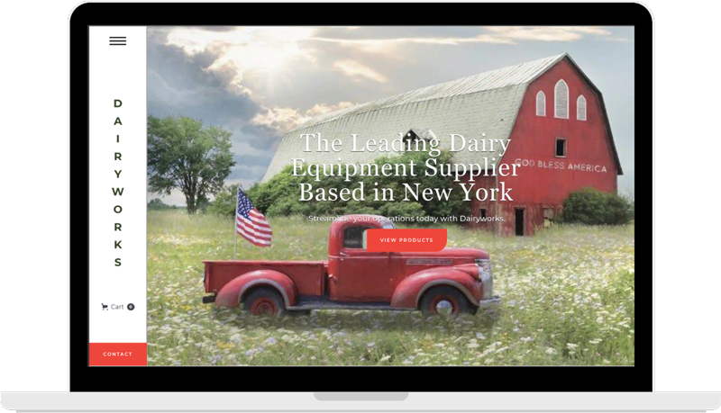
We led with a UX-first design philosophy rooted in clarity, trust, and speed—just like Dairyworks' own service ethos. The structure prioritized quick access to core offerings, contact information, and brand credibility.
To attract a new generation of buyers while staying true to the brand’s legacy, we focused on organic visibility through SEO. By optimizing on-page content, metadata, and search architecture, we ensured Dairyworks ranked for high-intent, industry-specific queries. The result was a steady stream of inbound traffic from farmers and vendors actively seeking refrigeration and equipment services.
We developed a lifecycle email strategy to keep Dairyworks top-of-mind with existing clients—featuring seasonal service reminders, maintenance tips, and product education. Paired with a content strategy focused on retention, we created value-first materials that reinforced Dairyworks’ expertise and reliability—building long-term trust and customer loyalty with every send.
Key Platform
- Development: Webflow
- Performance: Optimized for fast load times and mobile usability
- Marketing Channels: LinkedIn, Google, Email
Visual & Creative Highlights
- Minimalist Layout with Heritage Cues
We used a grid-based structure, soft neutral tones, and subtle typographic nods to tradition—bridging old-school reliability with modern usability - On-Brand Photography and Iconography
We incorporated real service imagery and custom farm-inspired icons to build authenticity and break away from cold, corporate templates - Streamlined Navigation for Utility
A sticky header, clear CTAs, and no-nonsense menu structure make it easy for busy farm operators to find what they need—fast
Results
Qualitative Wins
- A faster, mobile-optimized experience that mirrors Dairyworks’ service efficiency
- A brand-aligned, professional site that builds trust with existing and new customers
- A modern digital foundation built for scalability as the business continues to grow

Client Overview
The Goals
- Designing a modern, elegant website that reflects the brand’s values
- Driving qualified traffic through SEO and targeted social media campaigns
- Generating consistent online sales through an optimized e-commerce experience
Our Approach
Strategy & Execution
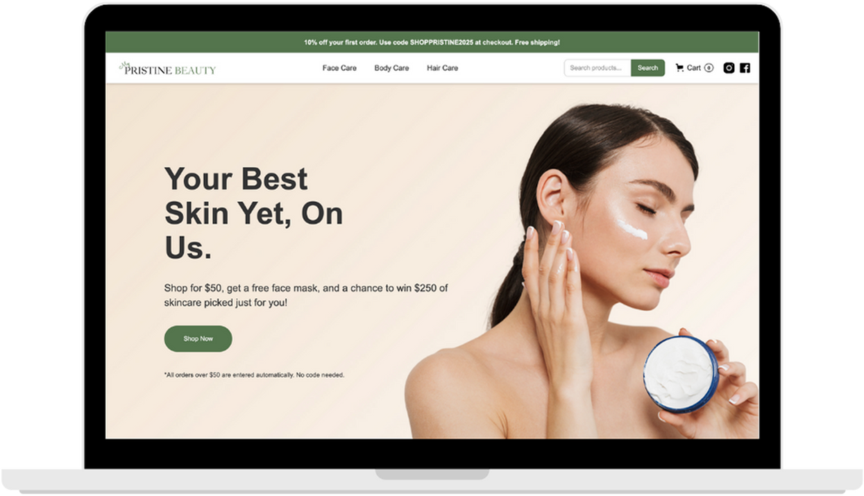
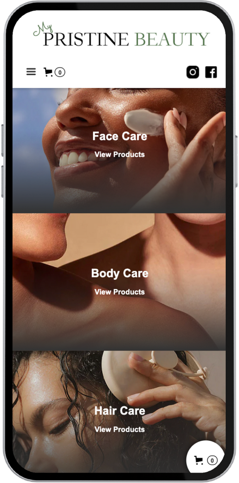
We delivered a sleek, editorial-inspired UX/UI approach tailored to showcase a curated product catalog. Built on Webflow, the site emphasizes clarity, elegance, and seamless conversion pathways—from homepage discovery to product checkout.
On the marketing side, we implemented an organic-first growth strategy, focusing on long-tail SEO optimizations and search-optimized content architecture. Simultaneously, we launched targeted campaigns on Meta platforms to drive traffic and build retargeting audiences.
We crafted high-impact product landing pages designed to convert at every scroll—combining persuasive visuals, crisp messaging, and social proof. Automated sales flows handled abandoned carts, welcome series, and limited-time offers, ensuring shoppers were engaged from first click to final checkout.
Tools & Stack
- Development: Webflow
- Marketing Channels: SEO (Google Search), Meta Ads (Facebook/Instagram)
- Analytics: Google Analytics, Meta Events Manager
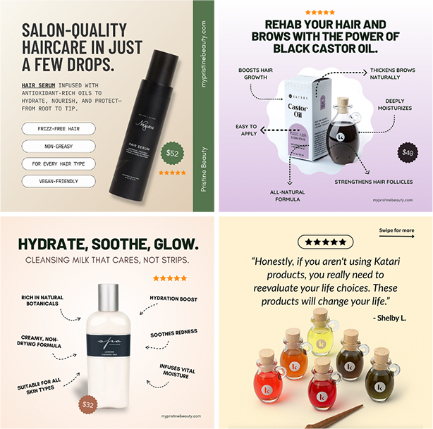
Visual & Creative Highlights
- Immersive Product Showcases:
A clean, conversion-ready interface featuring high-resolution product visuals, interactive filtering, and scroll-based animations - Engaging Social Creatives:
A series of eye-catching ad creatives tailored for Meta platforms, spotlighting seasonal offers, user testimonials, and beauty bundles
Results
Qualitative Impact
- 25,000+ website events tracked
- 3,500+ unique users engaged
- First sales came through within 90 days of launching ad campaigns
Qualitative Wins
- A significant uplift in brand trust and customer confidence
- Scalable content architecture for ongoing SEO growth
- Positive client feedback and an elevated brand presence across platforms
Nayo
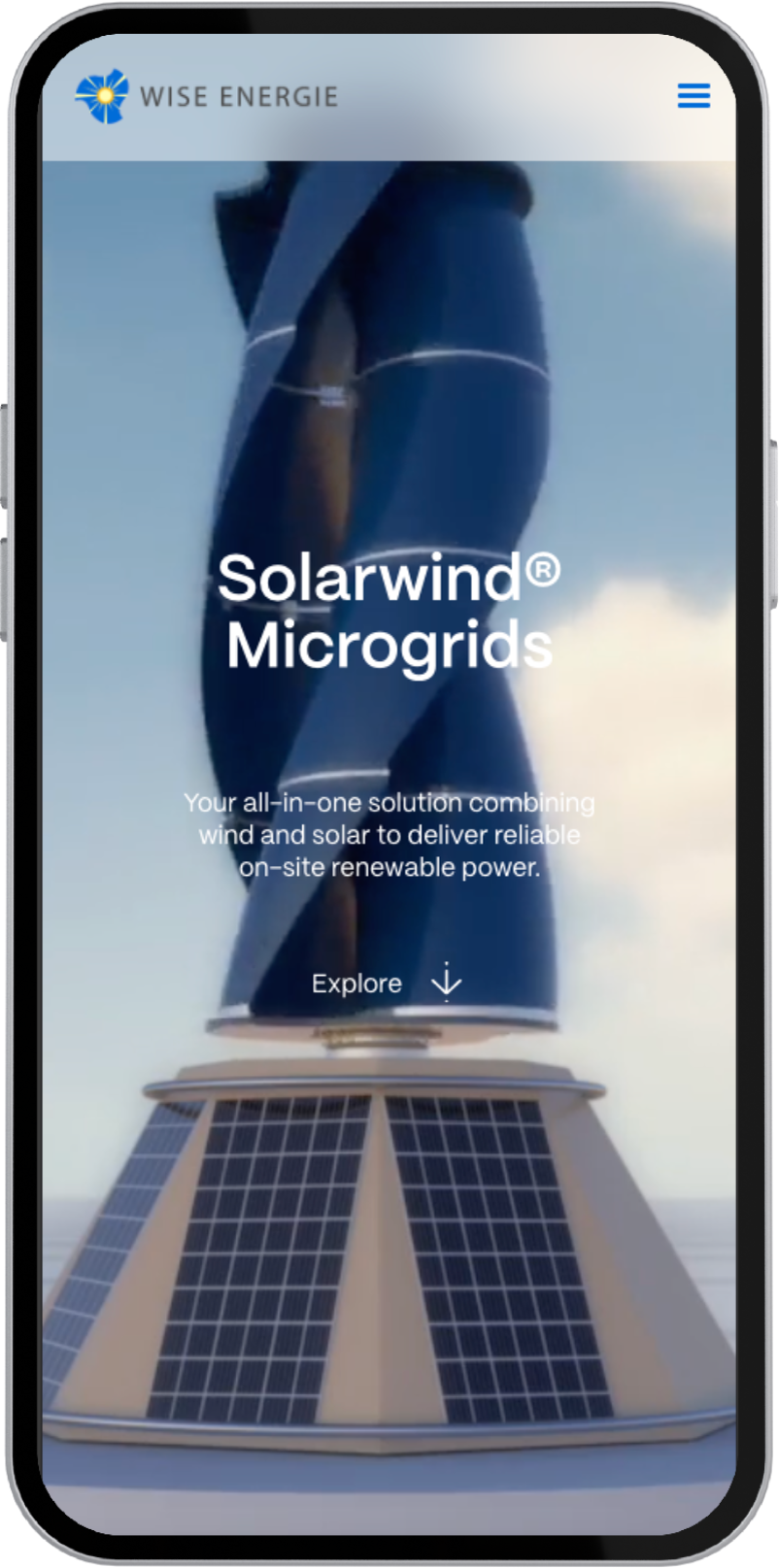
Wise Energie
Client Overview
The Goals
- Develop a bold, intuitive app interface aligned with brand values of safety, simplicity, and speed
- Craft a seamless UX for riders and freelance drivers across different ride types (taxis, bikes, private cars)
- Deliver a high-performance app that’s optimized for rapid adoption and ease of use

Our Approach
Strategy & Execution
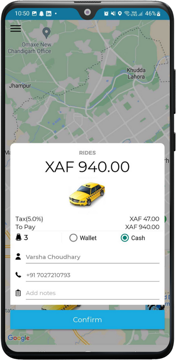
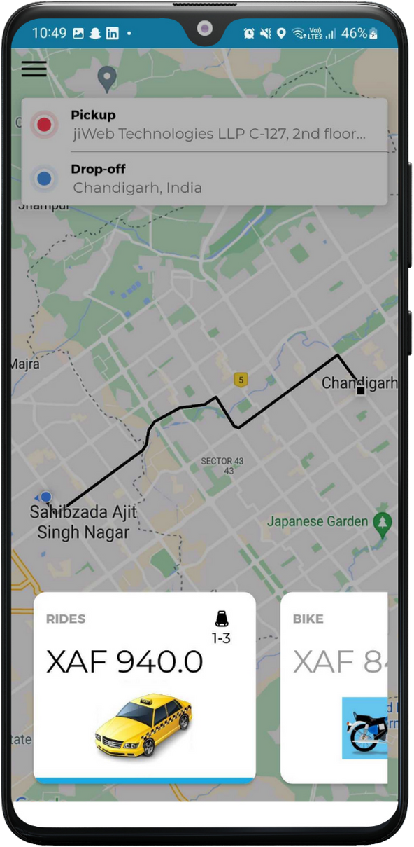
We built a bold, intuitive brand identity that reflects Nayo’s mission to make urban transport safer, simpler, and more accessible. From the logo design to a streamlined UI/UX system, every element was crafted to serve a wide user base—from tech-savvy riders to first-time app users. Developed using React, the app emphasizes performance, scalability, and ease of use—with a responsive map interface, frictionless booking flow, and built-in trust signals like driver ratings and verification.
Tools & Stack
- Development: React
- Design System: Lightweight UI kit built for speed and legibility
- Focus Areas: Rider onboarding, booking flow, geolocation integration, trip tracking
Visual & Creative Highlights
- Localized Design with Global Feel:
We blended bold Cameroonian color accents with intuitive navigation patterns common to global ride apps—ensuring instant familiarity and cultural relevance - Microinteractions That Guide & Delight:
From button states to live trip feedback, every tap and swipe is met with responsive feedback for user confidence - Streamlined Booking Flows:
Riders can choose between taxi, car, or bike in seconds—no clutter, just clarity
Results
Qualitative Impact
- 1,000+ downloads within weeks of launch, with rapid early adoption from local riders
- High app performance across regions, even on lower-end mobile devices
Qualitative Wins
- A smooth, fast-loading app praised for ease of use and design clarity
- Strong alignment between brand values and user experience
- Positioned Nayo as a credible, tech-forward alternative in Cameroon’s transportation space
Client Overview
The Goals
- Crafting a bold, future-focused brand identity that inspires trust
- Designing a clean, compelling website that communicates the technology simply
- Showcasing the versatility of the product for multiple high-impact sectors
Our Approach
Strategy & Execution
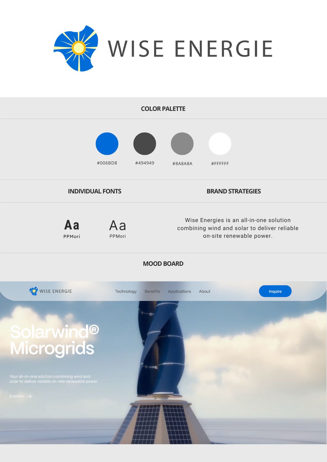
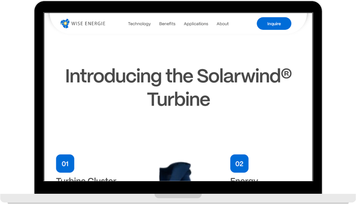
We led with a clarity-first design system, built to convey advanced technology in a way that’s both aspirational and accessible. The brand identity leaned into bold typography, sustainable color palettes, and modular components—creating consistency across the web experience.Built on Webflow, the site is fully responsive, lightning fast, and easy for the Wise team to update as new applications and use cases emerge.
Tools & Stack
- Development: Webflow
- Design Approach: Modular layouts, intuitive hierarchy, clean grid structure
- Performance: Speed, mobile responsiveness, and low-friction navigation
Visual & Creative Highlights
- Impact-Driven Homepage Design:
The homepage quickly communicates Wise Energie’s unique hybrid approach with dynamic visuals and sector-specific callouts - Energy-Inspired Motion Design:
Subtle scroll animations and microinteractions evoke the movement of wind and solar—giving life to a traditionally static sector - Scalable Sector Architecture:
The website was designed to scale vertically, with easily replicable modules for new industries, partnerships, or case studies
Results
Qualitative Wins
- A fast, high-performance website that mirrors the reliability of Wise’s product
- Strong visual storytelling that reinforces the company’s innovation and trustworthiness
- A scalable digital framework ready to grow with the business across sectors
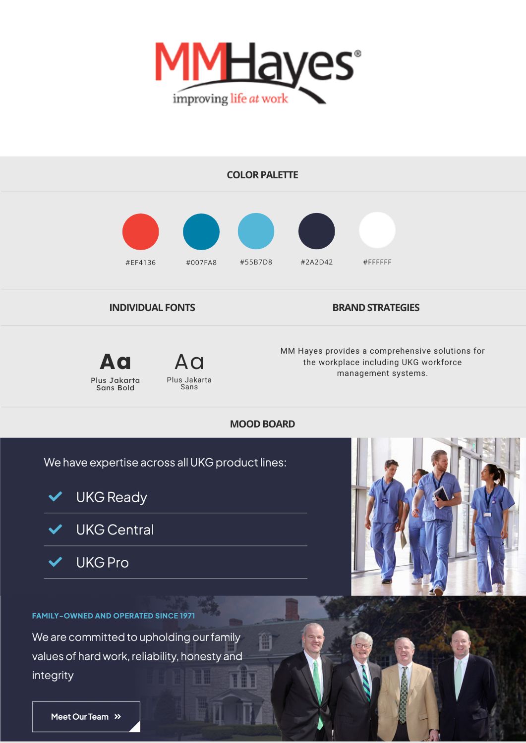
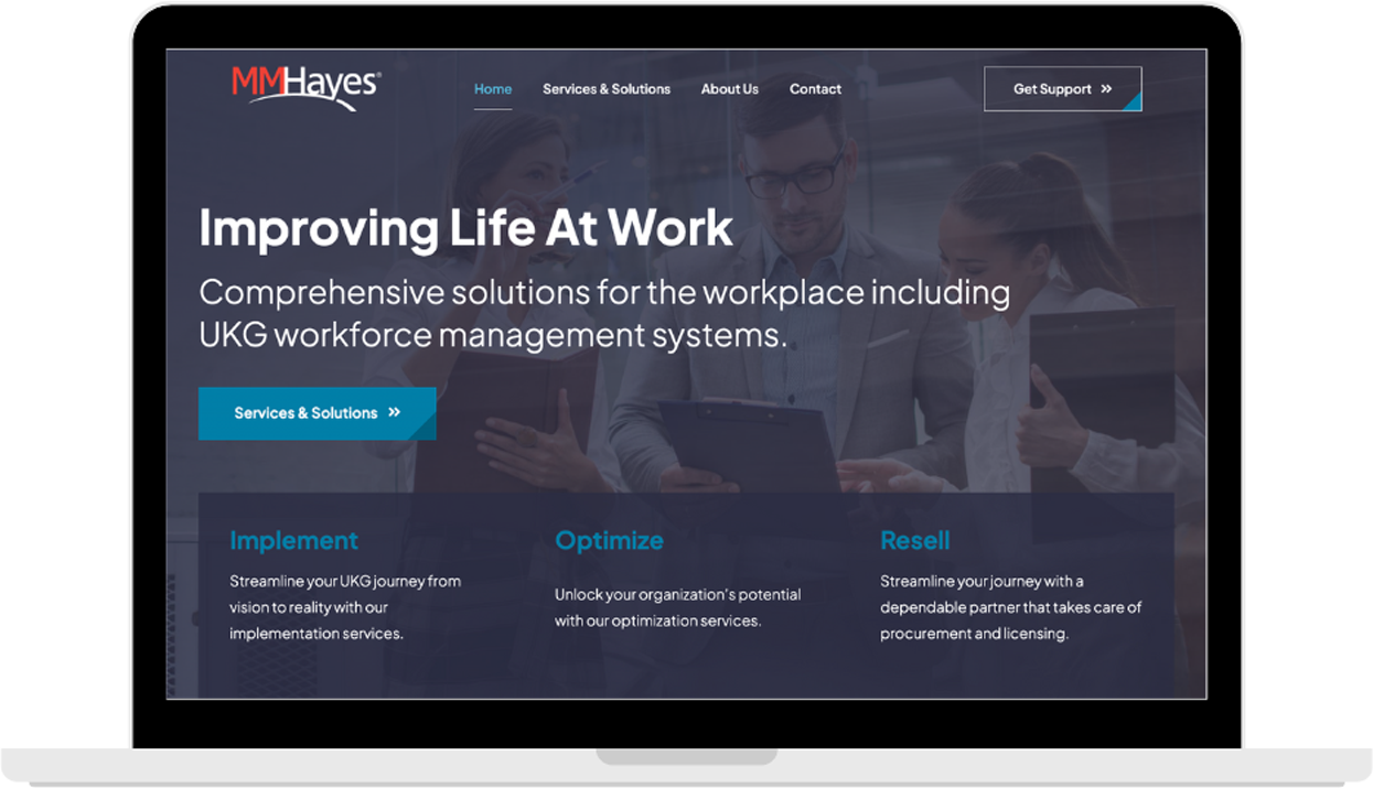
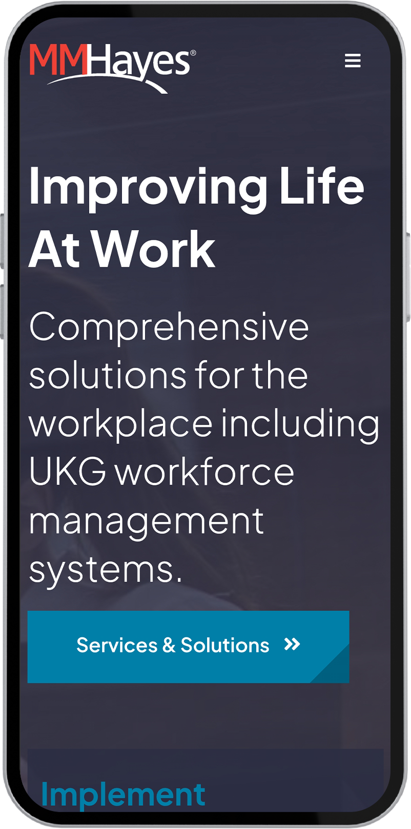
M.M. Hayes
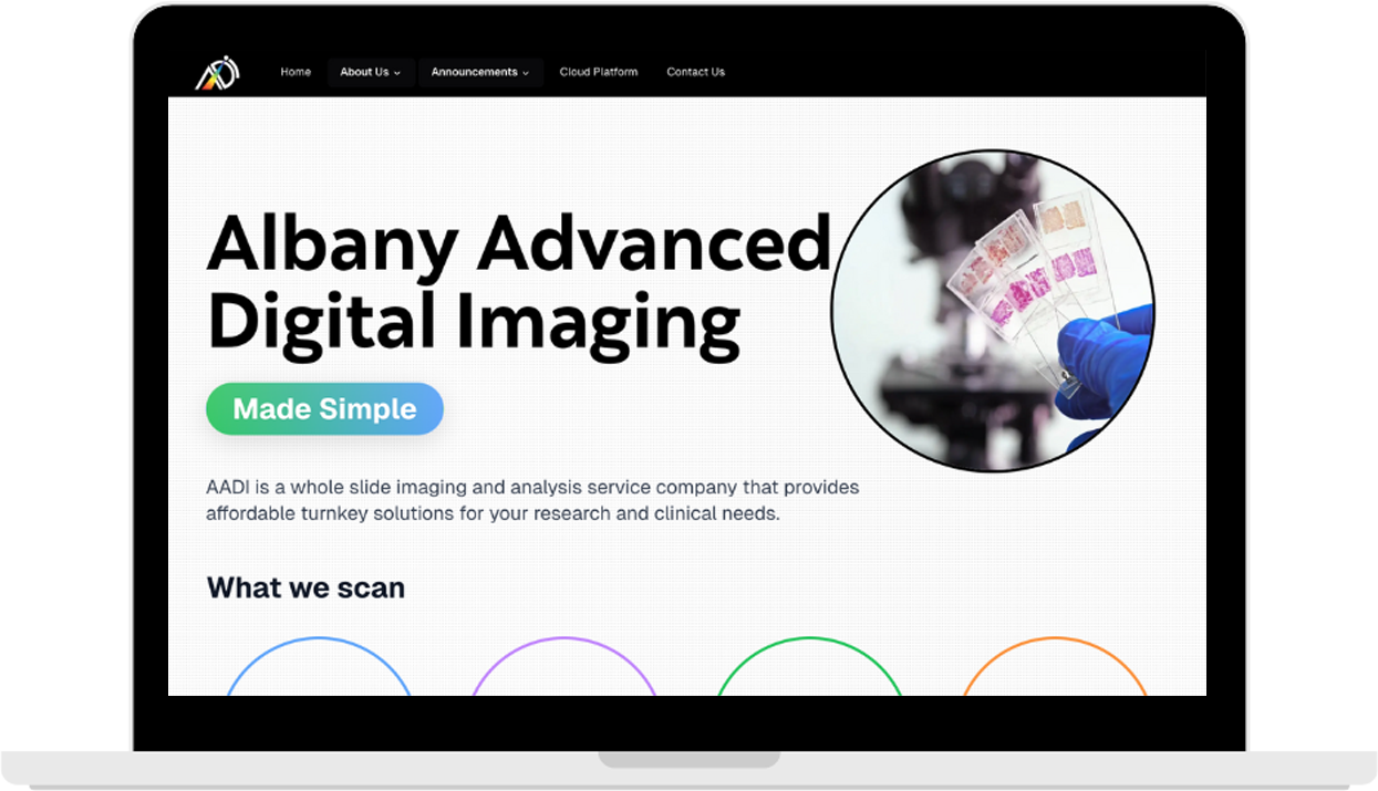
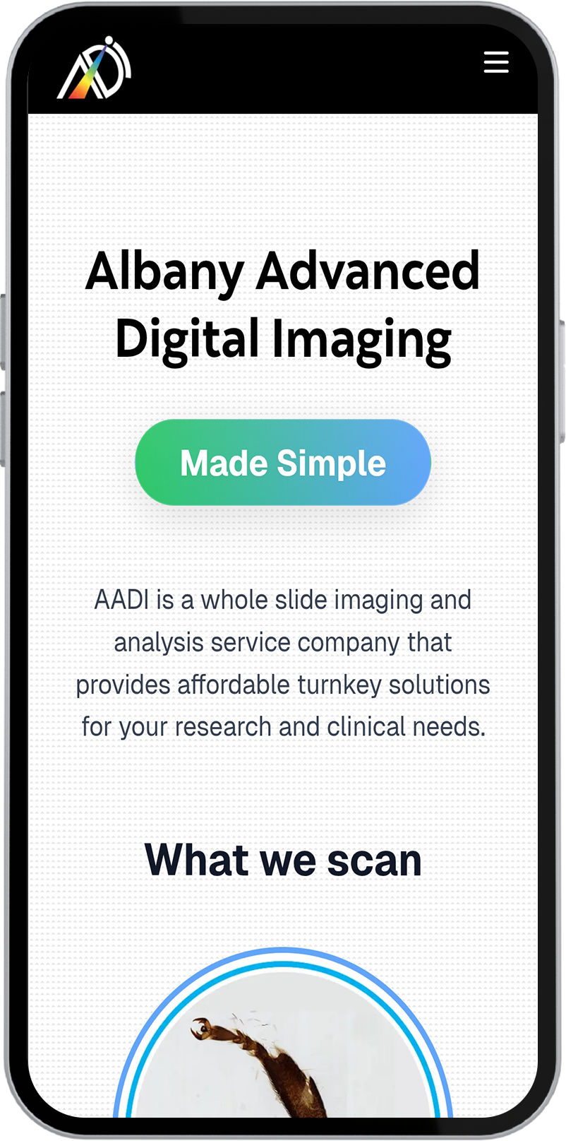
AADI
Client Overview
The Goals
- Developing a refreshed brand identity rooted in the company’s mission
- Designing a clean, accessible website that tells their story with clarity
- Creating a digital experience that resonates with decision-makers
Our Approach
Strategy & Execution
We began with brand discovery sessions to distill the core identity of M.M. Hayes—balancing legacy, reliability, and innovation. This insight informed a new visual system and digital strategy, carried through to UX, layout, and tone. The website, built on Wordpress, emphasized intuitive navigation, clear service hierarchies, and conversion-ready touchpoints for lead generation. Typography, colors, and iconography were all crafted to reflect both modern tech aesthetics and long-standing trust.
To support M.M. Hayes’ shift toward a modern, scalable digital presence, we implemented a multi-channel lead generation strategy centered around visibility, relevance, and qualified capture. We launched targeted LinkedIn Ads with segmented messaging to speak directly to decision-makers in SMBs—driving traffic to custom lead capture landing pages optimized for conversions. Simultaneously, we executed an SEO strategy that boosted organic discoverability around workforce management and cashless payment queries. Every campaign was supported by real-time ROI tracking, enabling the team to understand which audiences, keywords, and messages were generating the most value—and refine accordingly.
Tools & Stack
- Development: Wordpress
- Marketing Channels: LinkedIn, Google
- Performance: Fast-loading, scalable, and mobile-optimized
Visual & Creative Highlights
- Heritage-Inspired Modern Design:
The new site architecture brings together historic roots and forward-thinking solutions. Clean layouts, contemporary sans-serif typography, and a deep blue/gold palette convey authority and trust - Dynamic Interactions and Micro-UX:
Subtle transitions, hover states, and sticky CTAs were implemented to keep the experience engaging without overwhelming the user - Engaging Social Creatives:
Homepage and product pages were rewritten to emphasize impact—translating complex software capabilities into benefits that resonate with decision makers
Results
Qualitative Wins
- A fast, responsive website that reflects the maturity and mission of the M.M. Hayes brand
- A future-ready brand identity and digital foundation for marketing growth
- Strong internal alignment on brand story and voice across teams
Client Overview
The Goals
- Establish a credible and modern brand identity that reflects their innovation
- Design a website that communicates complex technical services with clarity
- Create a platform that inspires trust among PIs, research teams, and institutions
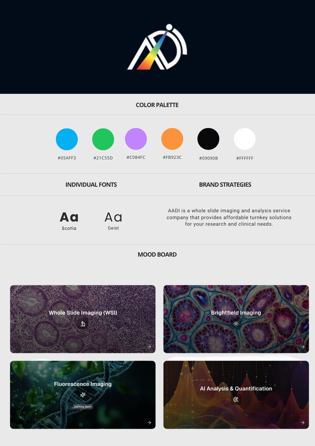
Our Approach
Strategy & Execution
We approached the project with a clarity-first UX strategy, designed to translate highly technical capabilities into approachable, benefit-driven messaging. Every design choice was rooted in accessibility, scalability, and scientific credibility. Built using Webflow, the site is responsive, performance-optimized, and structured for future growth—whether for showcasing case studies, service updates, or expanding capabilities.
To connect with principal investigators and research teams in a meaningful way, we launched a targeted LinkedIn Ads strategy focused on precision audience segmentation. By identifying niche academic and healthcare segments, we were able to deliver tailored messaging that spoke directly to the needs of grant-driven labs and institutions.
Tools & Stack
- Development: Webflow
- Marketing Channels: LinkedIn
- Performance: Optimized for fast load times and mobile usability
Visual & Creative Highlights
- Scientific Precision, Humanized Aesthetics:
A minimal yet bold design language with a monochrome and blue accent palette evokes both clinical precision and academic integrity - Simplified Service Architecture:
Clear pathways for different research team needs (e.g., pricing, how it works, upload flow) make it effortless to understand and engage with their offering - Responsive, No-Frills UX:
The site loads quickly, adapts elegantly across devices, and minimizes cognitive load—perfect for busy researchers seeking answers, not fluff
Results
Qualitative Wins
- A clear, modern, and trustworthy online presence that elevates the brand’s scientific mission
- A site that feels as advanced as the technology it represents—yet as accessible as the labs it serves
- Positive feedback from academic partners and improved clarity in lead generation
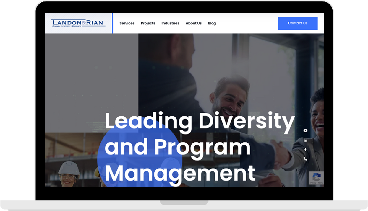
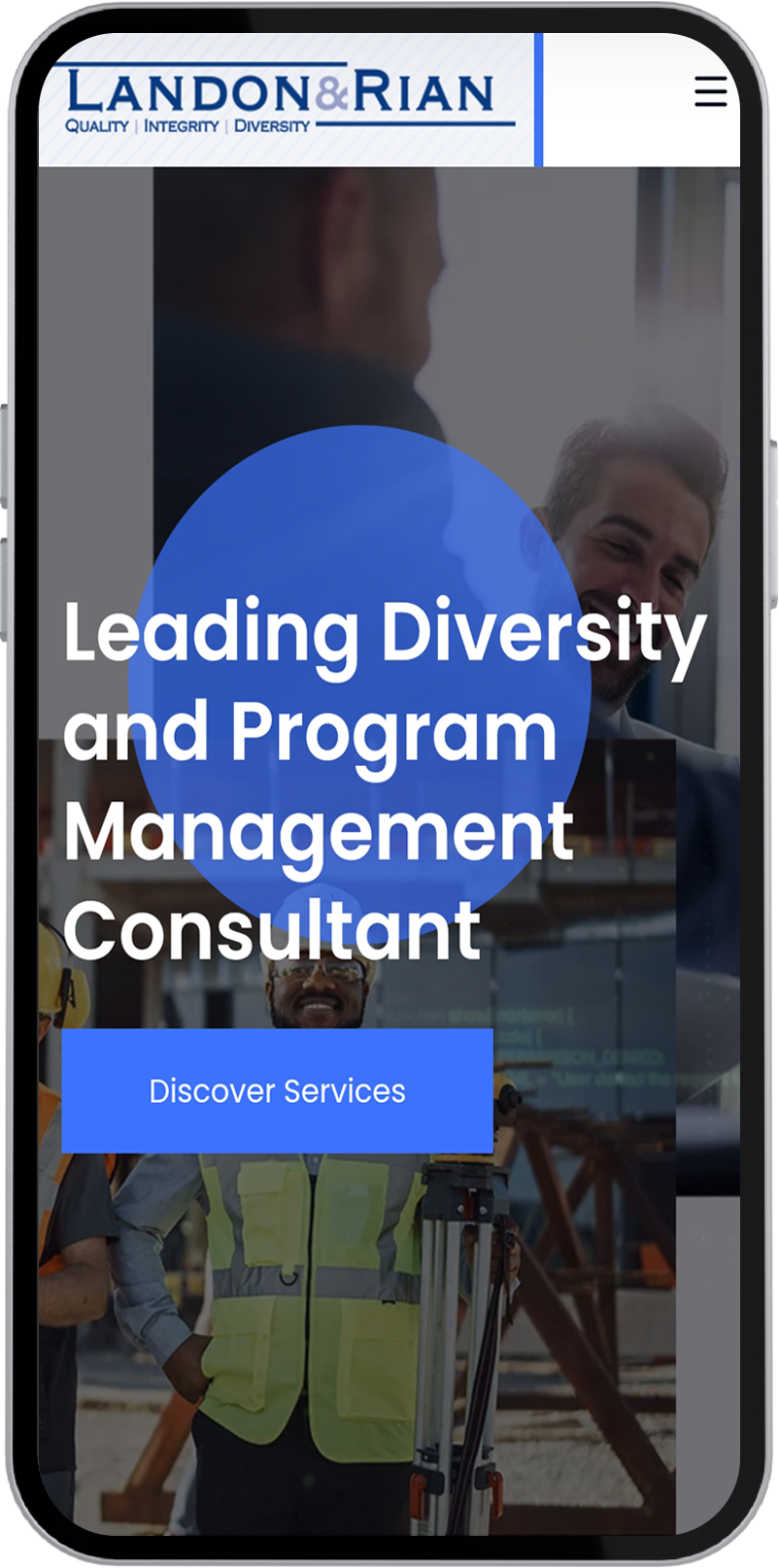
Landon and Rian
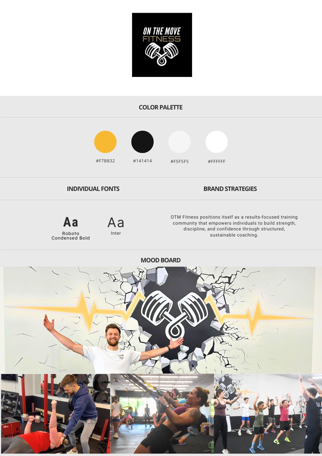
On The Move Fitness
Client Overview
The Goals
- Build a modern, credible brand system and website that reflects their professionalism and cross-sector impact
- Revitalize their underperforming LinkedIn presence to increase visibility, authority, and engagement in key industry verticals
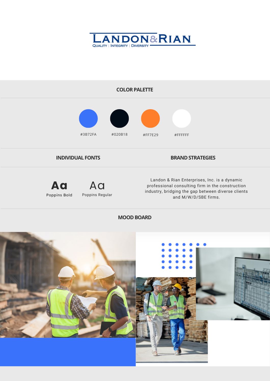
Our Approach
Strategy & Execution
We crafted a lean, authoritative UX strategy tailored to institutional decision-makers. Built on Webflow, the site prioritizes service clarity, credentials, and social proof—delivered in a fast, responsive framework with scalable backend structure.
Our content-first approach focused on repositioning Landon and Rian as thought leaders, not just service providers. We developed a consistent cadence of expert-led posts, behind-the-scenes insights, and industry-relevant content—supported by updated branding and optimized profile structure.
Tools & Stack
- Development: Webflow
- Marketing Channel: LinkedIn
- Content: Social copywriting, visuals, scheduling, analytics
Visual & Creative Highlights
- Clean, Grid-Based Web Design:
A modular layout that reflects engineering discipline—clean lines, minimal color accents, and sharp type hierarchy make the site both functional and elegant - LinkedIn Content Revamp:
From static posts to value-led storytelling, we shifted tone and structure to attract project managers, compliance leads, and institutional stakeholders - Impact-First UX Messaging:
Each section on the website reinforces trust: services, testimonials, certifications, and real-world impact—crafted for conversion without the clutter
Results
Qualitative Impact
- 65% increase in organic LinkedIn impressions
- 30% growth in follower count
- 2x increase in engagement rate
Qualitative Wins
- A professional, fast-loading site that aligns with the brand’s authority
- Elevated digital presence across web and social—leading to stronger pipeline conversations
- Renewed clarity and consistency in both tone and visual identity
Client Overview
The Goals
- Build a modern, performance-led website aligned with their transformation brand
- Design and deploy email and SMS campaigns to re-engage inactive contacts
- Strengthen customer retention through value-first communication
- Drive membership referrals and repeat signups via automated touchpoints
Our Approach
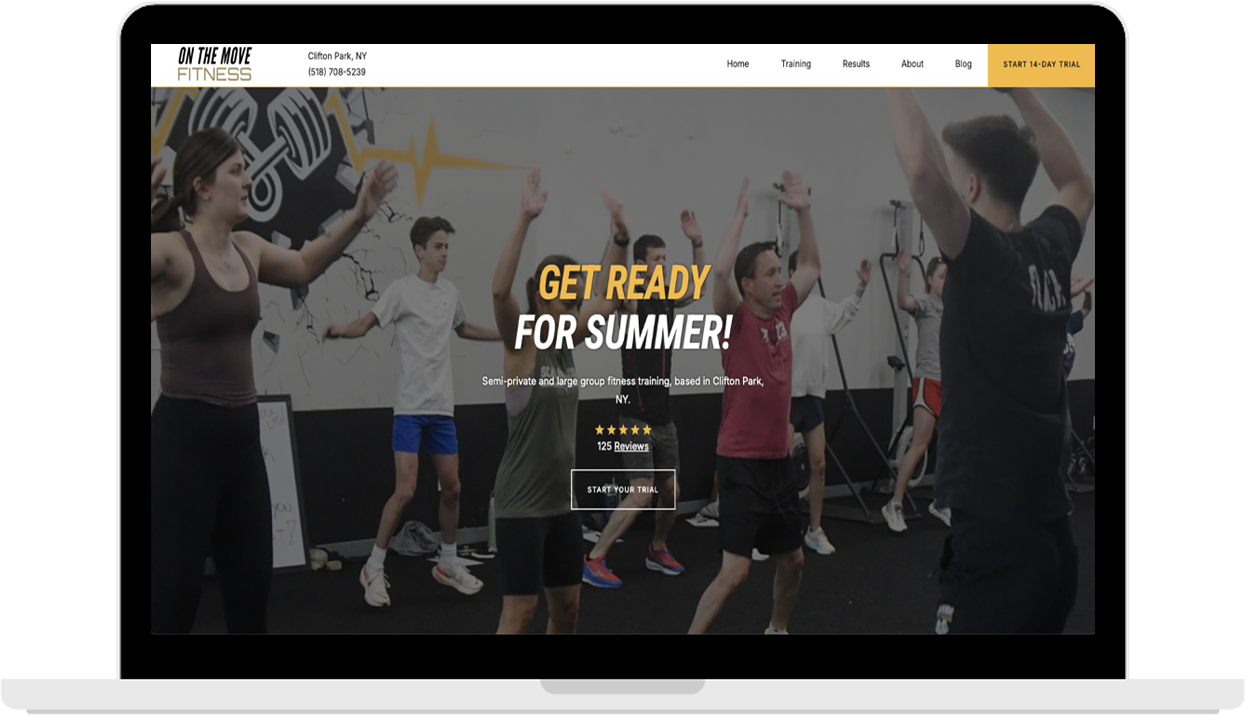
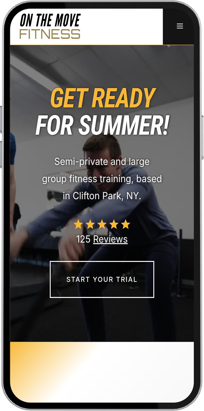
Strategy & Execution
We reimagined On The Move Fitness’s digital presence with a bold, performance-forward brand system. From logo design to a clean, kinetic UI/UX system, the site architecture was designed to reflect the energy and precision of the training itself. Developed in Webflow, the site delivers a fast-loading, responsive experience that showcases transformation stories, training pathways, and client outcomes with visual clarity—guiding visitors seamlessly from interest to action.
We executed a full-funnel lead generation strategy across Google, Facebook, Instagram, and LinkedIn Ads, paired with a long-tail SEO framework to capture both paid and organic demand. Custom lead capture landing pages and a thoughtfully designed pre-capture funnel guided users from first touch to conversion, while advanced audience targeting and segmentation ensured relevance at every stage. All campaigns were tracked with real-time ROI analytics to continuously optimize performance and scale what worked.
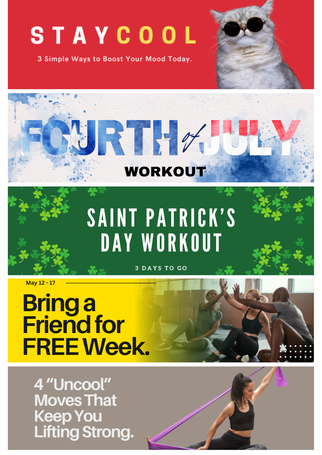
We built a retention engine powered by email and SMS campaigns, customized by member behavior and fitness goals. From milestone-driven check-ins to reactivation messages for dormant users, each communication was designed to reinforce commitment and extend member lifetime value.We also integrated a referral program and churn-risk analytics, enabling proactive outreach and loyalty-building incentives. These touchpoints helped transform first-time clients into repeat customers and brand advocates.
Key Tools & Channels
- Website Platform: Webflow
- Marketing Channels: Meta Ads, Google Search, high-converting landing pages
- Retention Tools: Vagaro (Email/SMS), Referral Program Management
- Automation & Analytics: Re-engagement workflows, churn-risk detection, performance tracking
Visual & Creative Highlights
- Heroic Transformation Layouts:
Full-width imagery, sharp typography, and high-contrast modules that showcase before-and-after success stories and athlete performance in motion - Clean UX, Built to Convert:
Clear CTAs, mobile-first responsiveness, and seamless navigation across membership options, classes, and transformation journeys - Retention Campaigns with Real Muscle:
From reactivation emails to loyalty-driven SMS nudges, we delivered messaging designed to inspire, motivate, and bring members back to the mat
Results
Quantitative Wins
- Increased membership sign-ups from previously inactive contacts
- Boost in referrals and re-bookings via automated follow-ups
- Higher engagement rates across both email and SMS campaigns
Qualitative Wins
- A fast, visually elevated website that reflects the brand’s performance ethos
- Stronger customer loyalty and reactivation through targeted, motivational content
- Renewed brand trust from both long-time clients and new prospects
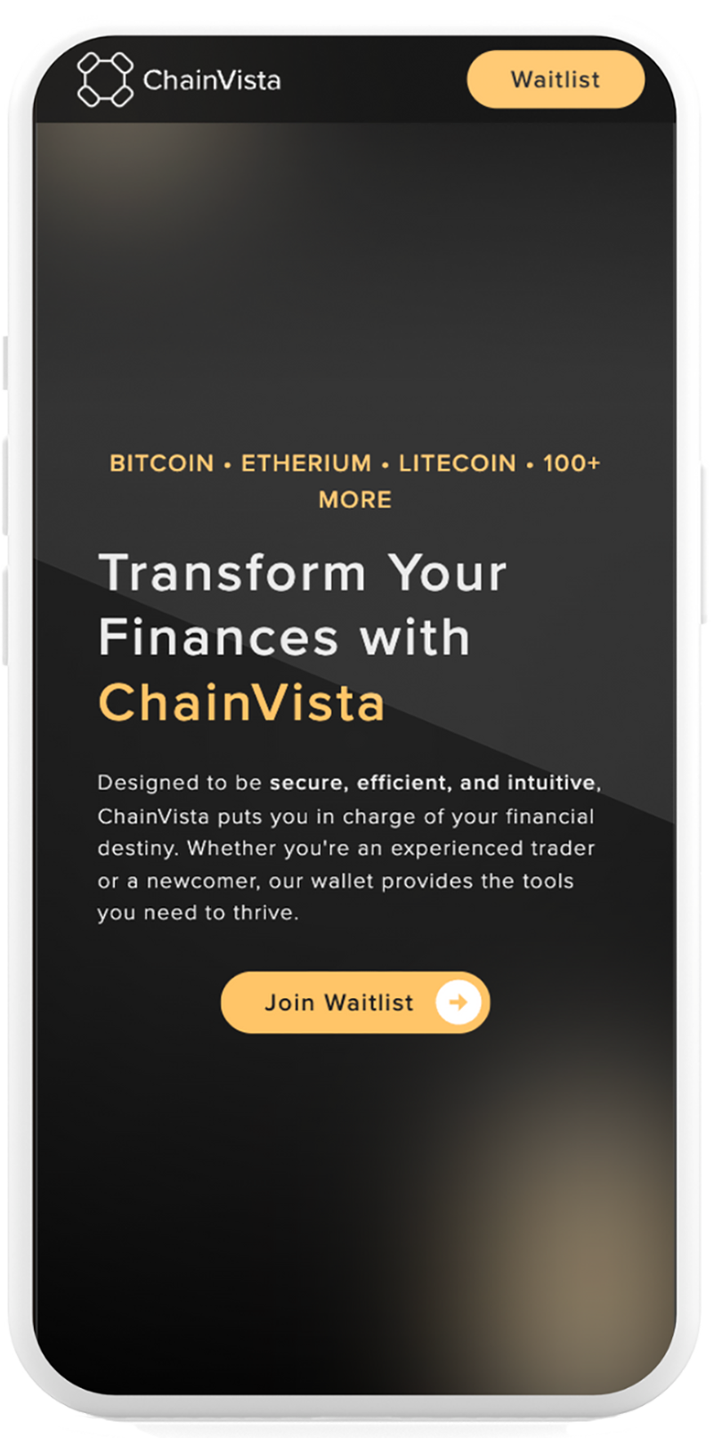
Chainvista
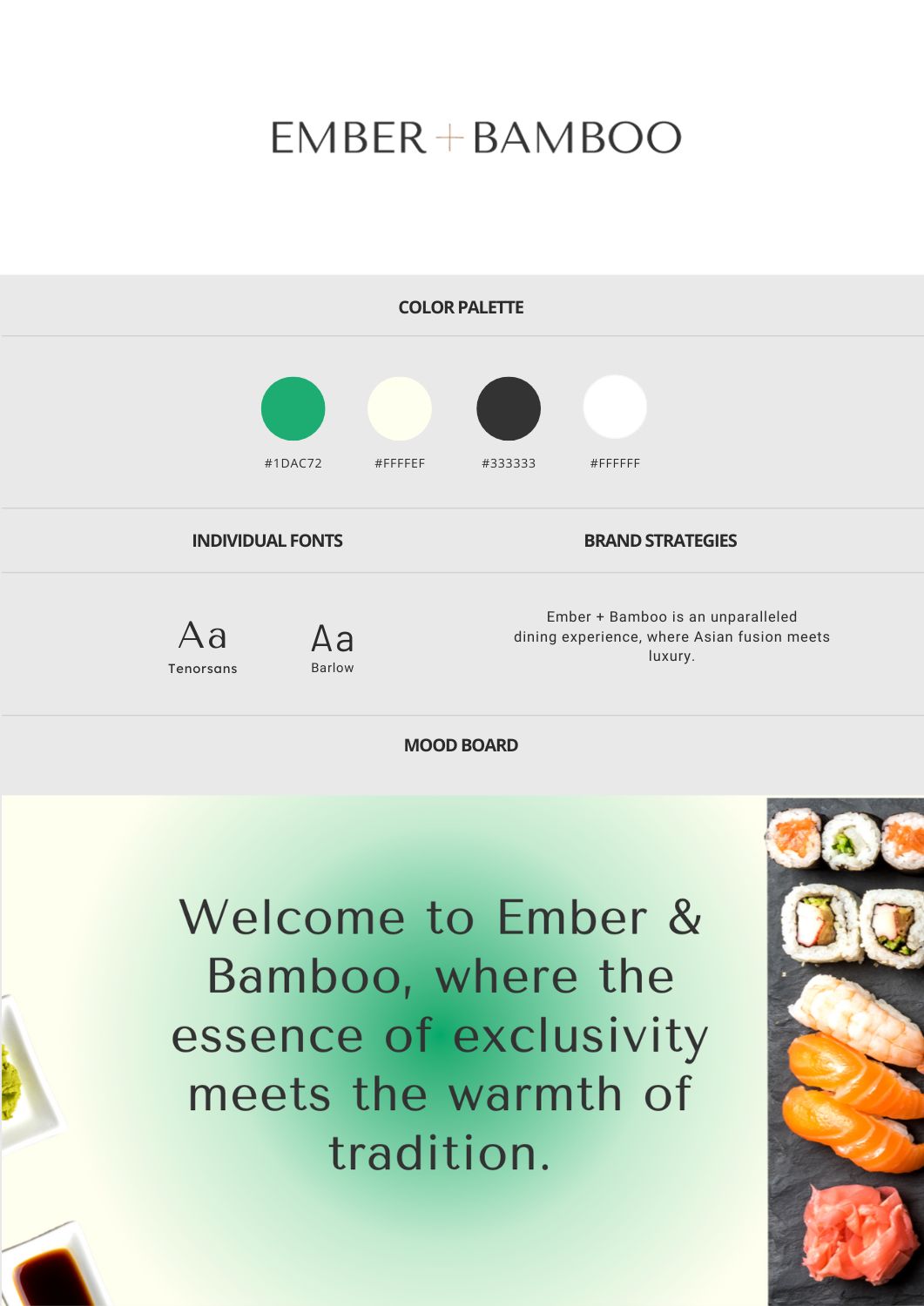
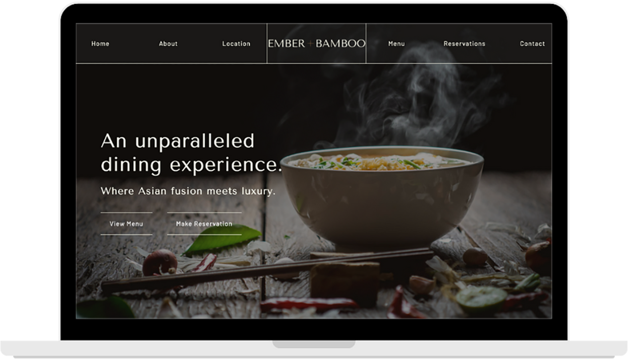
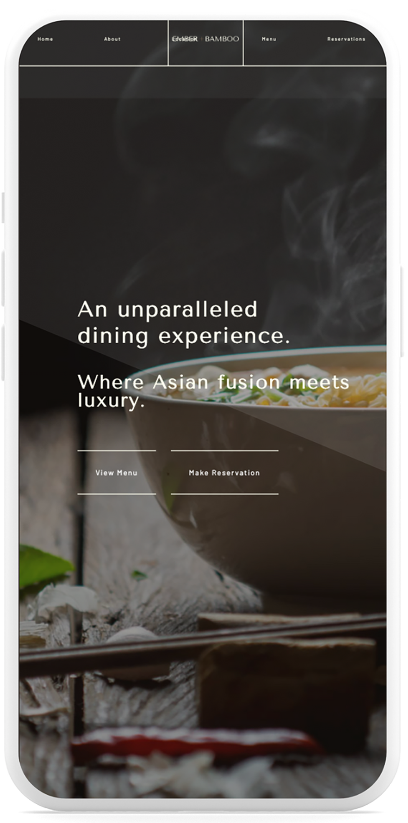
Ember and Bamboo
Client Overview
The Goals
- Define a clear, high-trust brand identity in a competitive fintech space
- Design a performance-focused website that communicates product features with clarity and authority
- Deliver a sleek UX that feels as fast and intuitive as the wallet itself
Our Approach
Strategy & Execution
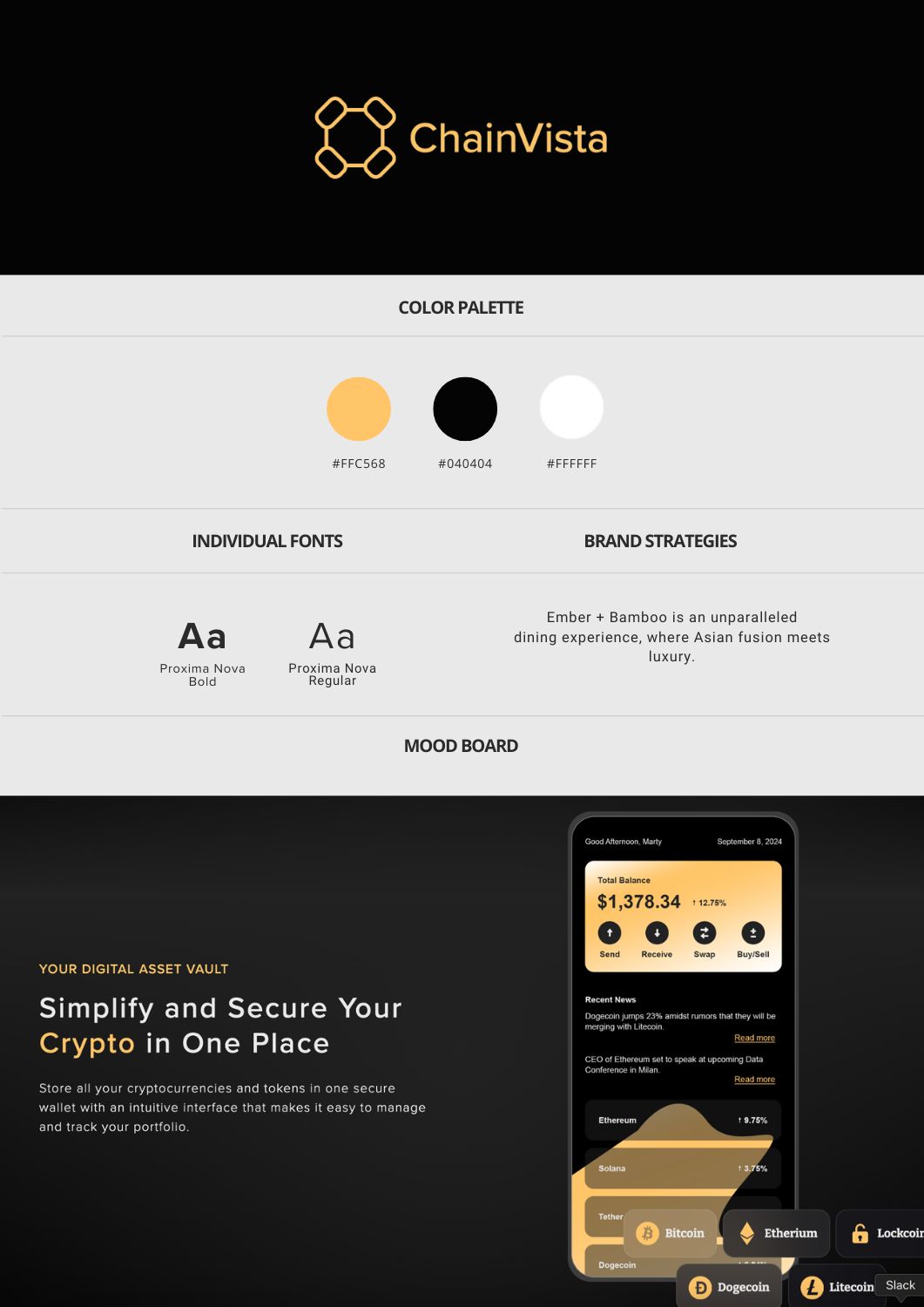
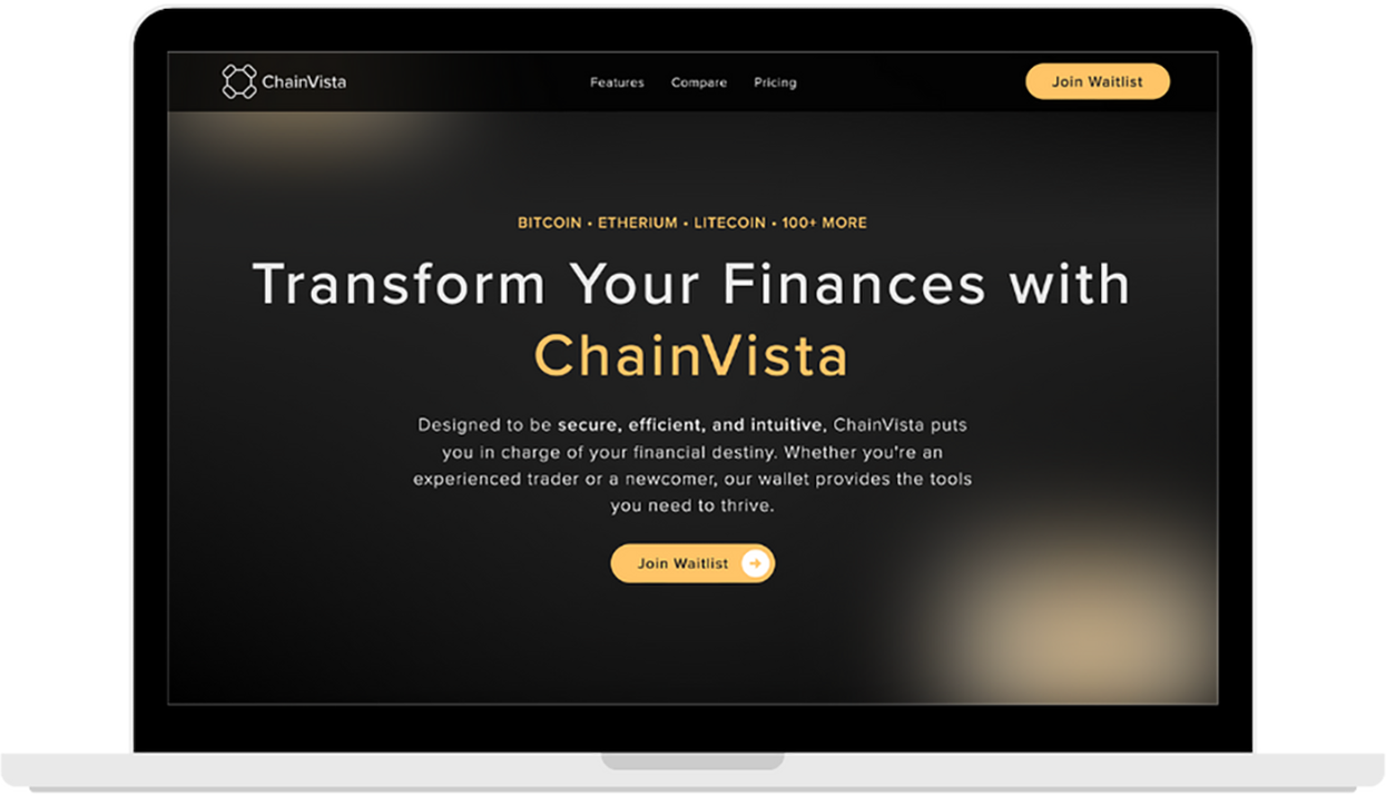
We developed a sharp, modern brand identity that mirrors ChainVista’s speed and technical edge. From logo design to a streamlined UI/UX system, every element was crafted to evoke trust, clarity, and performance. Built on Webflow, the website was optimized for mobile responsiveness and fast load times—guiding users from product understanding to conversion with clean, intuitive design.
Tools & Stack
- Development: Webflow
- Creative Direction: Clean, high-contrast UI with strategic use of microinteractions
- Performance: Load time, clarity of architecture, crypto-native UI conventions
Visual & Creative Highlights
- Dark Mode, Light Touch:
A sleek, dark interface with pops of yellow hues—a nod to digital finance environments—balanced with clean white space for legibility - Live Demo-Style Interactions:
Interactive wallet previews and subtle scroll animations emulate product behavior, creating familiarity and engagement before signup - Visual Hierarchy Built for Traders:
Bold headlines, trust signals, and performance stats are given prominence—mirroring the no-nonsense logic of Chainvista’s user base
Results
Qualitative Impact
- A fast, conversion-ready website that aligns with Chainvista’s technical edge
- Visual identity now matches the product’s performance and UX excellence
- Positioned the brand for launch and investor conversations with credibility and polish
Client Overview
The Goals
- Designing a modern, elegant website that reflects the brand’s values
- Creating a refined brand identity that blends Asian heritage with modern sophistication
- Ensuring the site loads fast, navigates easily, and entices new diners to explore and reserve
Our Approach
Strategy & Execution
We crafted a brand identity that fuses Asian heritage with modern elegance, capturing the restaurant’s immersive dining philosophy. From logo design to a tailored UI/UX system, every detail was designed to reflect sophistication, warmth, and sensory depth.Developed in Webflow, the site combines graceful motion, fast performance, and seamless mobile responsiveness—inviting diners to experience the ambiance before they even book a table.
Tools & Stack
- Development: Webflow
- Creative Direction: Minimal, luxurious, and immersive
- Performance: Smooth scroll, fast page load, easy mobile navigation
Visual & Creative Highlights
- Editorial-Inspired Layouts:
Large, cinematic imagery paired with refined typography to evoke a high-end print magazine aesthetic - Subtle Interactions & Motion:
Delicate hover effects and scroll-based animations add movement without distraction—mimicking the flow and finesse of fine dining - Custom Menu Showcase:
A curated visual treatment for food and drink offerings that balances white space, elegance, and appetite appeal
Results
Qualitative Impact
- A fast, beautifully responsive website that reflects the restaurant’s ambiance and excellence
- A visually rich platform that builds brand perception and drives reservations
- Seamless alignment between in-person experience and digital storytelling
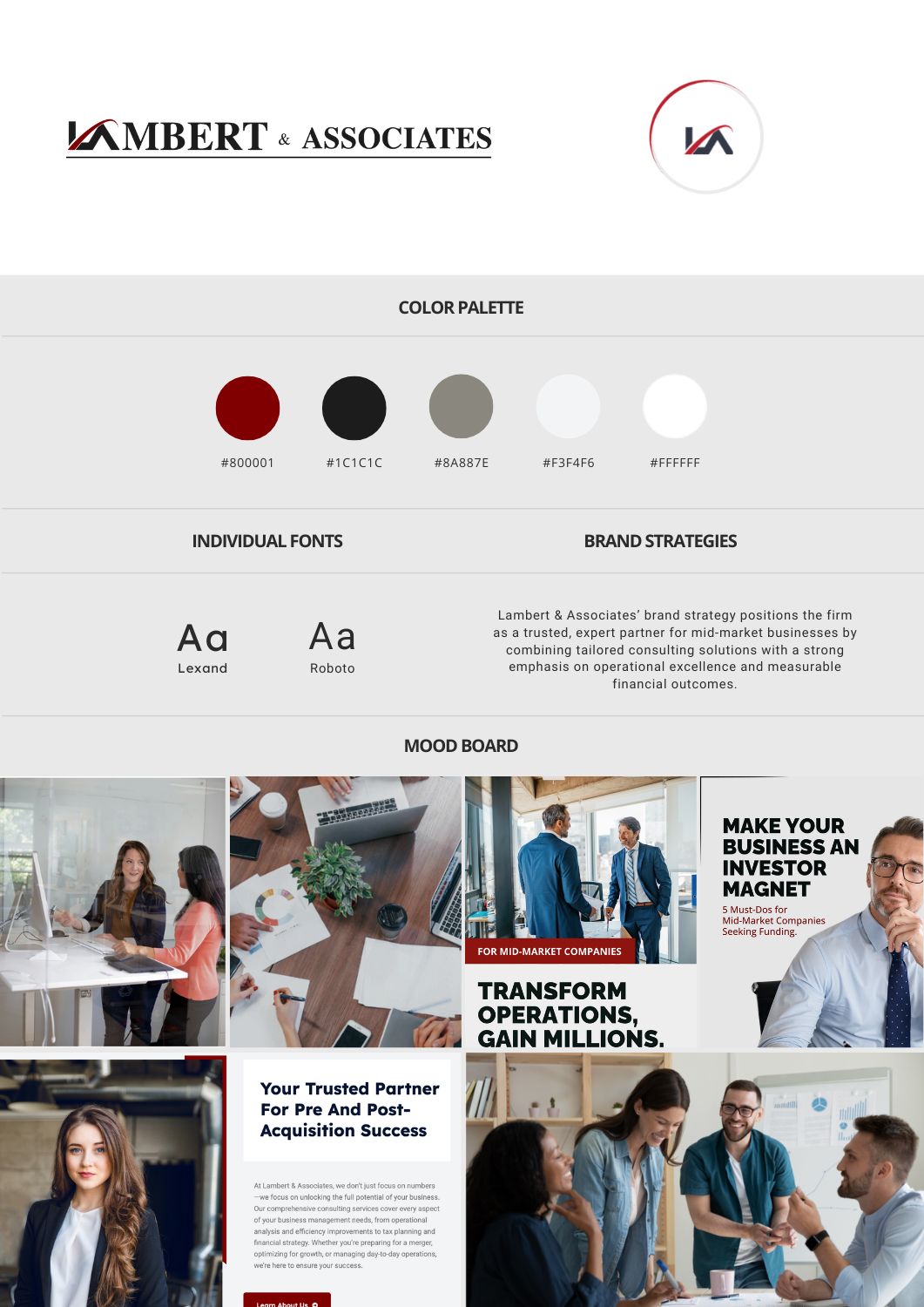
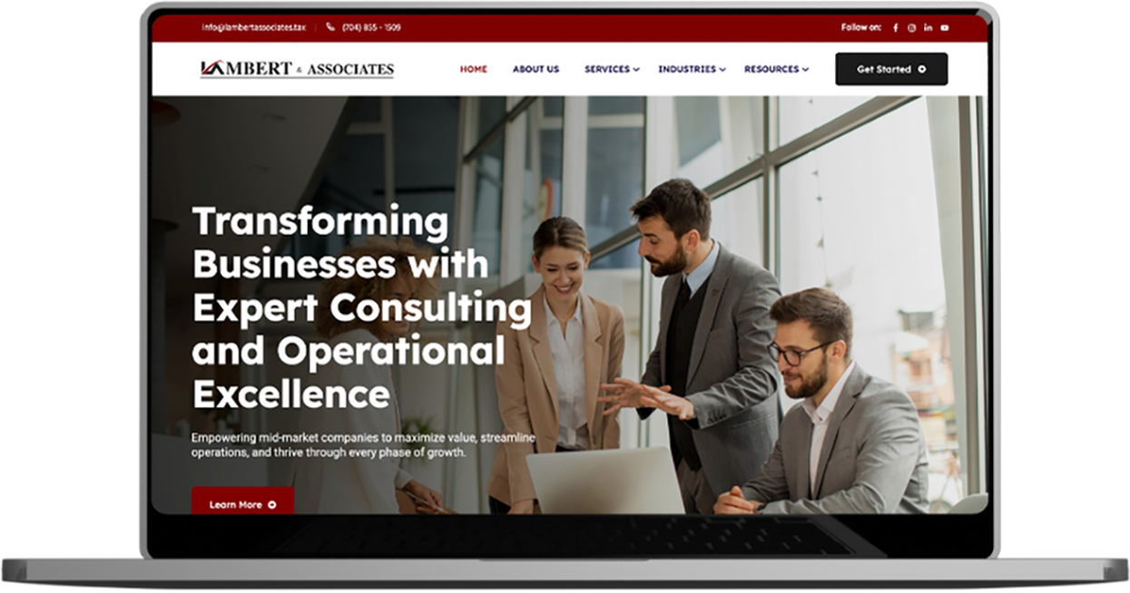
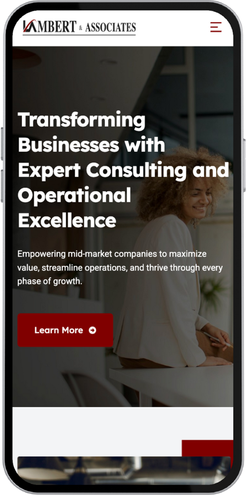
Lambert and Associates
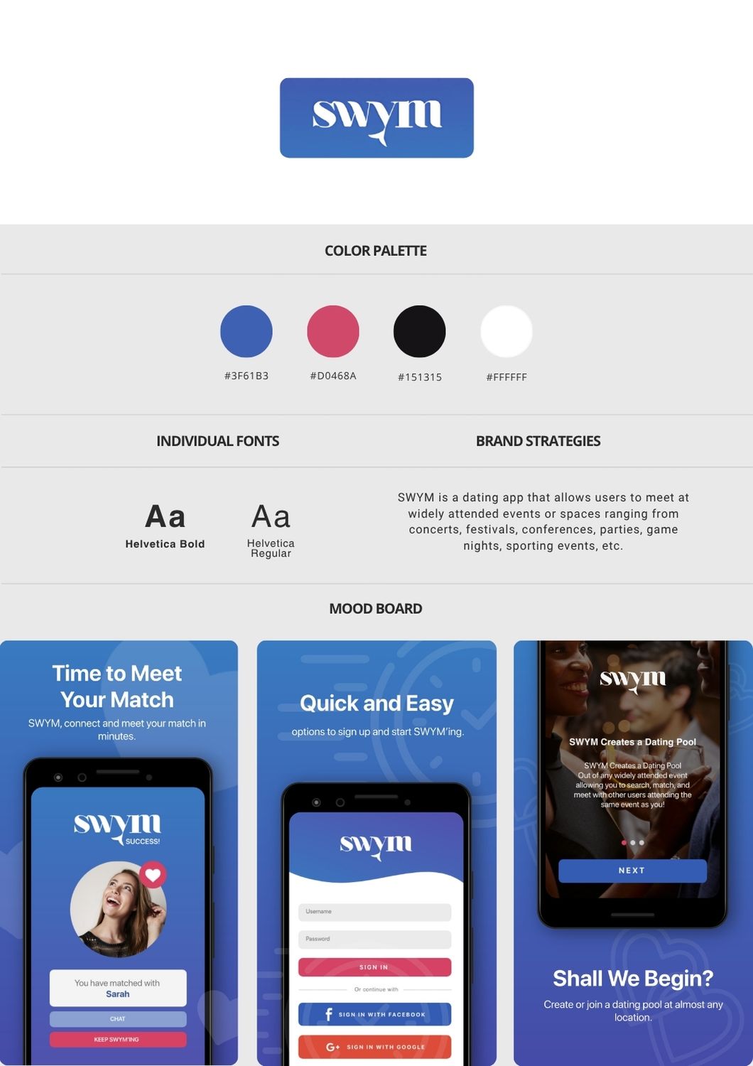
Swym
Client Overview
The Goals
- Reposition the brand with a modern identity and conversion-focused web presence
- Generate qualified leads for their consulting programs using multichannel outreach
- Set up a CRM-powered sales infrastructure to track, nurture, and close leads
- Build authority and visibility via organic and paid content channels
Our Approach
Strategy & Execution
We redefined Lambert & Associates’ brand with a clean, authoritative identity that reflects their expertise and growth-focused approach. From logo design to a custom UI/UX system, we created a professional yet approachable visual language tailored to mid-market decision-makers. Developed on Webflow, the website was built for speed, clarity, and SEO performance—guiding prospects through personalized service paths with a focus on conversion and credibility.
Targeted LinkedIn ad campaigns + organic thought leadership content + SEO-led blog funnel to attract qualified traffic.
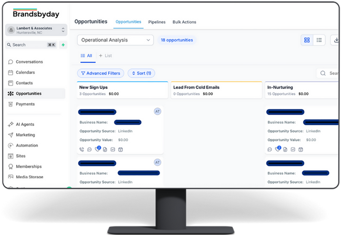
CRM setup, pipeline mapping, lead scoring, automated follow-ups, and custom playbooks integrated into a unified marketing platform (Brandsbyday All-in-One App).
Tools & Stack
- Development: Webflow
- Marketing Channels: LinkedIn Ads, Google SEO, Email Automation
- Analytics: Brandsbyday App (CRM, automations, sales pipeline)
Visual & Creative Highlights
- Clear, Trust-Centric Web Design:
A minimalist layout, neutral palette, and confident typography reflect the firm’s professionalism and precision - Conversion-Optimized Landing Pages:
A series of eye-catching ad creatives tailored for Meta platforms, spotlighting seasonal offers, user testimonials, and beauty bundles - Lead Magnet Strategy:
High-value downloadable templates and frameworks used to drive inbound traffic and nurture lead pipelines
Results
Quantitative Wins
- From zero to $110,000+ in warm leads within 60 days
- Surge in qualified traffic from both LinkedIn and organic search
- CRM-powered funnel with automated follow-ups and real-time tracking
Qualitative Wins
- A fast, professional site that reflects the brand’s value and authority
- A high-converting, end-to-end digital funnel now driving measurable growth
- Online visibility through consistent content marketing across LinkedIn and Google
Client Overview
The Goals
- Build a brand identity and app interface that reflects the dynamic, event-based nature of the platform
- Design a user experience that makes discovery and connection seamless, secure, and socially engaging
- Develop a lightweight, fast-loading mobile app that could handle high user concurrency at public events
Our Approach
Strategy & Execution
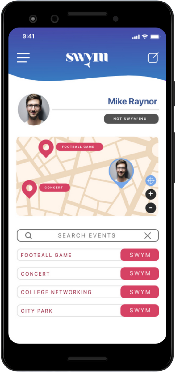
We crafted a bold, dynamic brand identity that mirrors Swym’s core value: meaningful, in-the-moment connections. From logo design to a responsive UI/UX system, the interface was built to feel fluid and ambient—whether you’re discovering someone at a concert or connecting quietly at a bookstore. Built in React, the app was optimized for real-time responsiveness, fast performance, and modular scalability. The design centered around the concept of “Pools”—event-based micro-communities—enabling users to join, interact, and connect in a way that feels spontaneous yet safe.
To build early traction and drive installs, we launched a targeted Google Ads campaign focused on interest-based and geo-specific intent. Ad creatives emphasized Swym’s unique event-based discovery model and real-time matchmaking experience, directing users to install-focused landing pages optimized for mobile conversion. We continuously iterated on messaging, audience targeting, and ad formats to boost cost-efficiency and bring in high-intent users primed to explore the app at live events.
To support Swym’s growth and retention strategy, we integrated key sales tech and analytics tools to track installs, optimize user activation, and monitor conversion events tied to user engagement. This included attribution setup for granular insight into ad performance, lifecycle journey mapping, and behavioral triggers that inform future outreach and re-engagement flows. These systems laid the foundation for smart remarketing, in-app personalization, and real-time feedback on what drives user adoption.
Tools & Stack
- Development: React
- Marketing Channels: Google Ads, Landing page funnels, Intent-based audience targeting
- Analytics: Attribution tracking, analytics integration, lifecycle conversion insights
Visual & Creative Highlights
- Pool-Based Discovery UI:
Users can join or launch event-specific pools with one tap. The design prioritizes real-time visibility and intuitive filtering within a crowd - Dynamic Vibe-Based Interface:
Color gradients and UI states adapt to the energy of the event (e.g., high-contrast for nightclubs, soft tones for bookstores), adding personality to the app experience - Subtle Motion & Microinteractions:
Animated transitions between user cards, pool join confirmations, and match alerts provide a playful and polished user journey without distraction
Results
Qualitative Wins
- A fast, elegant app experience tailored for live-event environments
- A unique visual language and interaction model that positions Swym as a category-defining dating product
- Positive early feedback from beta testers who praised the "refreshing" and "natural" way to meet people in real life
Ready to Turn Strategy Into Results?
If you’re looking to move fast, stand out, and grow smarter — we’ll bring the strategy, execution, and momentum to get you there.
Copyright 2026. Brandsbyday LLC